Theme & appearance
Settings → Theme & appearance (Beta) covers two things: how the app is coloured and textured, and how the navigation is laid out. Every option applies instantly and persists with your data — it survives restarts and new machines.
Light / dark
| Option | Behaviour |
|---|---|
| Follow system | Reads the OS preference and follows it live |
| Light | Always light |
| Dark | Always dark |
Accent palette
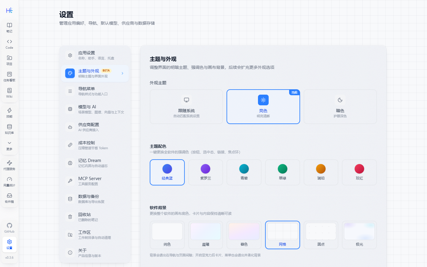
Six accents: classic blue, violet, cyan, emerald, amber, rose. Implementation-wise the whole Tailwind --color-blue-* / --color-indigo-* ramp is hue-shifted and chroma-scaled, so buttons, selection states, links and focus rings recolour at once — no per-component class changes.
Canvas background
Six canvases: solid, dawn, dusk, grid, dots, aurora. The background is painted on body while page content areas stay transparent, so the canvas colour shows through the gaps between cards and panels — which is exactly what makes the acrylic material readable.
| Canvas | Light | Dark |
|---|---|---|
| Solid | Near-white base | Near-black base |
| Dawn / dusk | Pink→blue→cyan / warm orange→violet→blue gradient | Same families, dark |
| Grid / dots | 26px / 22px light texture | Same grid, dark |
| Aurora | Three soft light blobs (violet / cyan / blue) | Same hues, saturated |
Acrylic material
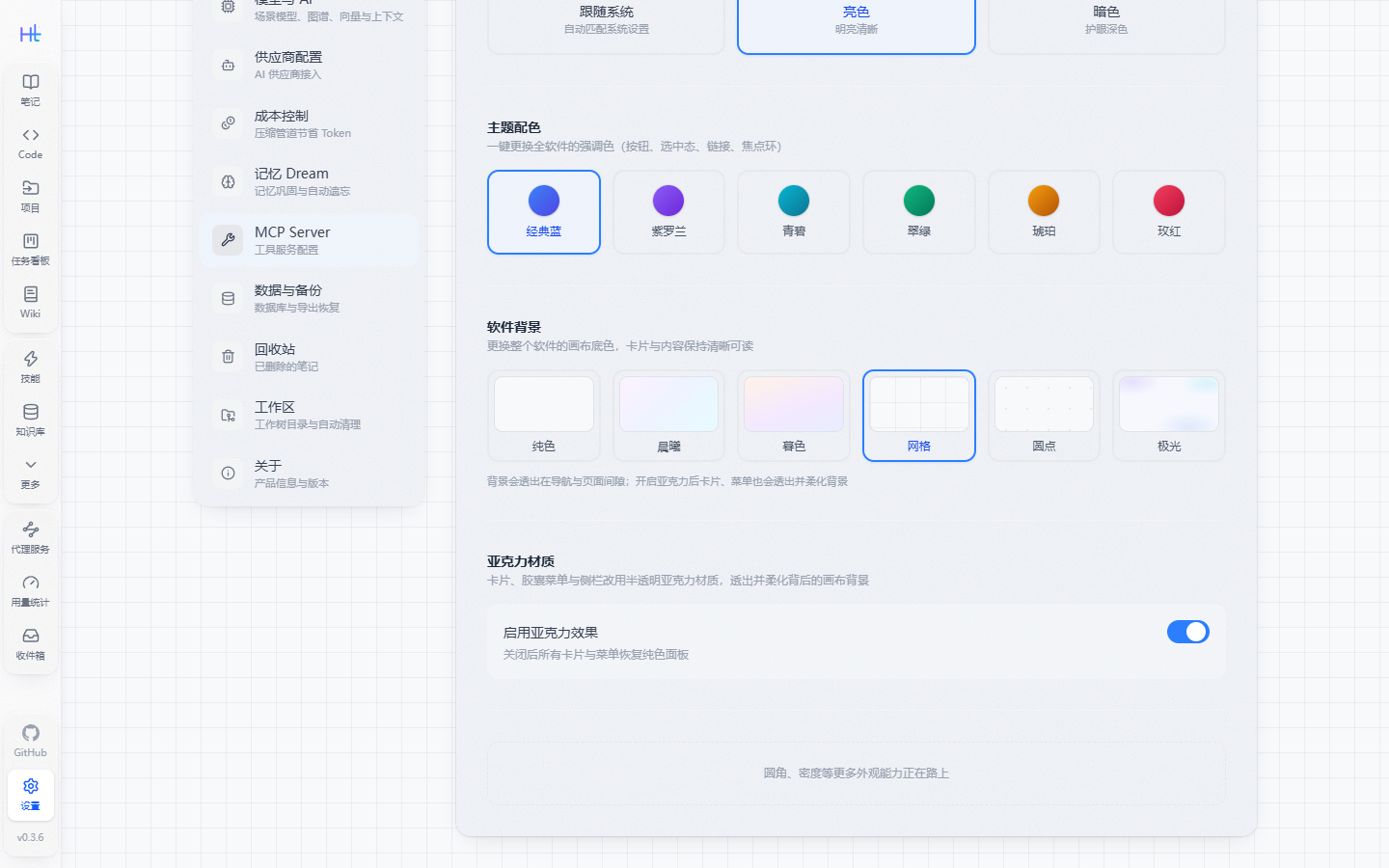
One switch for the whole app: cards, panels, pill tracks, nav bar and rail, inputs, toggles and filter chips all become a translucent material — tinted base + backdrop blur with saturation boost + fine noise + a top sheen, so the canvas colour bleeds through.
- The material lives on
::before: puttingbackdrop-filteron the host would turn it into the containing block for floating layers and misplace dropdowns - Form controls (
input/textarea) do not render pseudo-elements, so the material is painted on the host and the native white background is disabled - The nav bar and left rail use a denser material so they don't vanish on light canvases; pill tracks stay more transparent so the canvas shows through
- Switching it off returns every surface to plain white cards / grey tracks with no blur cost
Navigation menu
The same page also controls how navigation is laid out, applied immediately:
| Option | Values |
|---|---|
| Primary nav style | Top bar (default) / vertical pills (nav moves to the far left, icon and label stacked) / vertical list (nav moves to the far left, icon and title on one line, collapsible into a narrow rail) |
| Secondary menu style | Flat (parent and child menus side by side) / tree (merged into one tree, expand a parent to see children) |
| Pinned entries | Unpinned features stay reachable from the “More” menu; notes, chat, Code, workflows and search are always pinned |
| Hover tooltips | Card (default, frosted) / solid (dark capsule) / outline (thin border plus blur); direction can be auto, top, bottom, left or right |
Where settings live
- Theme, accent, canvas, acrylic switch and nav styles are stored in the backend settings table — the same mechanism as name and language under App settings
- The frontend prewarms these settings on startup, so a refresh or a fresh install shows your saved appearance immediately instead of flashing the default skin
- API:
GET /api/settingsto read,PUT /api/settingsto write (keysTheme/ThemeAccent/Background/GlassEffect/NavStyle/SecondaryMenuStyle)